Forum:We have a mobile view
Now that we're on Gamepedia, one of the features I'm most excited about is the fact that we've got a proper mobile version of the site now! I've got a quick-and-dirty front page set up (I just cherry-picked divs from Wowpedia). It still needs work, but it's a start. All of the rest of the articles should work on their own without much pain.
You can test how any page looks on the mobile frontend without having to do it on your phone by appending ?useformat=mobile to the end of the URL, or clicking the "Mobile view" link in the footer. Make sure to use the responsive design feature of your browser (^ Ctrl+⇧ Shift+M in Firefox) to constrain it to <400px in width to see how it'll actually look on a phone...
We do have access to sitewide CSS at MediaWiki:Mobile.css (yes, it works!), so we can copy stuff over to there to format everything properly. Thankfully, since we already design for both light- and dark-background skins, even with nothing in the mobile-specfic css the mobile view doesn't look atrocious. We may just want to copy over link formatting classes so the site stays on a white background, which tends to work better for phones... but we could go the other way too.
Upstream documentation at:
- https://www.mediawiki.org/wiki/Extension:MobileFrontend
- https://www.mediawiki.org/wiki/Mobile_Gateway/Mobile_homepage_formatting
--k_d3 01:36, 1 August 2013 (UTC)
- edit: I've added a bunch of css from common involving tooltip/link formatting as a starting point. --k_d3 02:06, 1 August 2013 (UTC)
- I wish I could opt out of this. It seems it detects Android as "mobile" no matter what, even a 1280x800 tablet that has a high enough resolution to display the desktop version. - Linneris (talk) 04:11, 1 August 2013 (UTC)
- The regular version of the site now looks horrible on a mobile device and has no functionality beyond badly formatted text.--SWM2448 04:13, 1 August 2013 (UTC)
- At the very bottom of any page in the mobile view is a link: "Permanently disable mobile site". Click that. It'll set a cookie to opt you out.
- I've only had enough time to get something visible on the main page and very little formatting beyond that (making sure tooltips work). It's going to need a lot of work to get it up to the desktop level of formatting. Please help me out! --k_d3 04:42, 1 August 2013 (UTC)
- The regular version of the site now looks horrible on a mobile device and has no functionality beyond badly formatted text.--SWM2448 04:13, 1 August 2013 (UTC)
- I wish I could opt out of this. It seems it detects Android as "mobile" no matter what, even a 1280x800 tablet that has a high enough resolution to display the desktop version. - Linneris (talk) 04:11, 1 August 2013 (UTC)
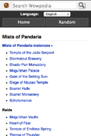
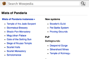
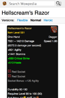
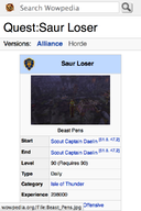
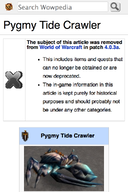
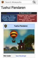
There was some work done on this over the past few weeks. Some current screenshots of the mobile skin are below; they're from desktop Firefox rendering in responsive design view for a 320x480 viewport (i.e. slightly taller than an ordinary mobile browser showing chrome, compounded by the absence of Curse's viewport-attached ads).
Some highlights: we're now able to render most of the main page content in the mobile view, without causing awkwardness with horizontal scrolling. Since the 1.21 update, wowpedia is able to serve higher resolution images for high-pixel density displays; we now support that in the the mobile view as well. For narrower screen sizes, pages that start with a tooltip/infobox can have that content centered within the view rather than floating awkwardly off to the side of an endlessly-wrapping introductory paragraph. Some frustrations:
- Some of the icons we use inline in articles, including faction icons, race icons, and misc things like
 are optimised for low-resolution displays and appear blurry on a high-resolution display.
 - Article management boxes, article-tagging templates like {{WorldEvent/Lunar Festival}} or {{Novel}}, and appear-at-the-top navigation templates like {{capital}} or {{classnav}} take up way more vertical space than is worthwhile.
- Wide tables in articles.
- Ads permanently anchored to the bottom of a mobile's screen feel annoying.
In terms of future plans, I'd like to see us get rid of the various boxes appearing above actual content on the mobile view (and above-content navigation templates like {{capital}} everywhere).
If you have access to a mobile device, feel free to see if the updated mobile skin works better for you. If you encounter any problems or think of any possible improvements, please post them here. — foxlit (talk) 21:58, 2 February 2014 (UTC)

